The 3 Logo Variations Your Small Business Needs
BUSINESS TIPS FOR PHYSICAL THERAPISTS, STRENGTH COACHES, DIETITIANS, AND MORE
When I ask new clients how many logos they think they’ll need it’s a resounding “fuck if I know” - and they’re right. That’s not something you need to know. But as someone who started up a business on their own, I know that having someone on the internet answer a question I might have is a lifesaver. So that’s exactly what we’re going to cover: how many logo variations your small business needs.
You’ll see varying answers on exactly how many logos you might need. Some clients only need two. One of my clients had sub-businesses within their umbrella business and needed north of 10. Your specific needs may drive the exact number of variations, but most people can get away with three: a primary logo, an alternate logo, and a submark or icon.

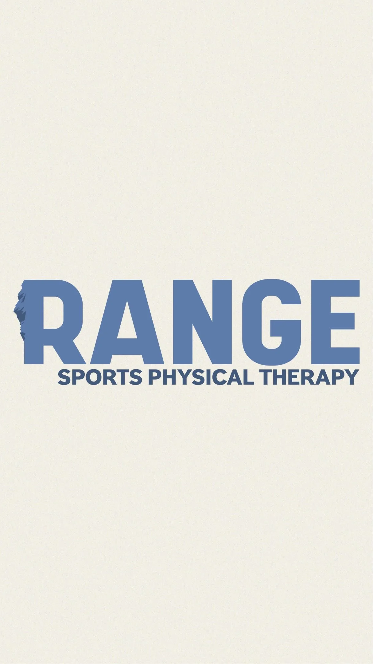
PRIMARY LOGO
There’s some room for discussion on what a primary logo is. Some would say it’s the logo you use the most. I tend to say it’s the one that contains the most information. This is the big one that might include your slogan, designator, location, established date, graphic, or anything else you want to include. I consider it primary because it contains all of your primary information. This one is especially important if your business name doesn’t exactly describe what you do. You need to have some sort of additional content that explains what you offer.
SECONDARY OR ALTERNATE LOGO
As the name states, this is a simpler or different version of your primary logo. This could be alternate in regards to the content you include but most importantly it should be a different layout. If your primary logo is horizontal, you’ll want an alternate logo that has a vertical or square layout. You’ll need both because there are some instances when you might need a vertical logo and a horizontal primary logo will be cut off or look like shit. And we don’t want your brand to look like shit.
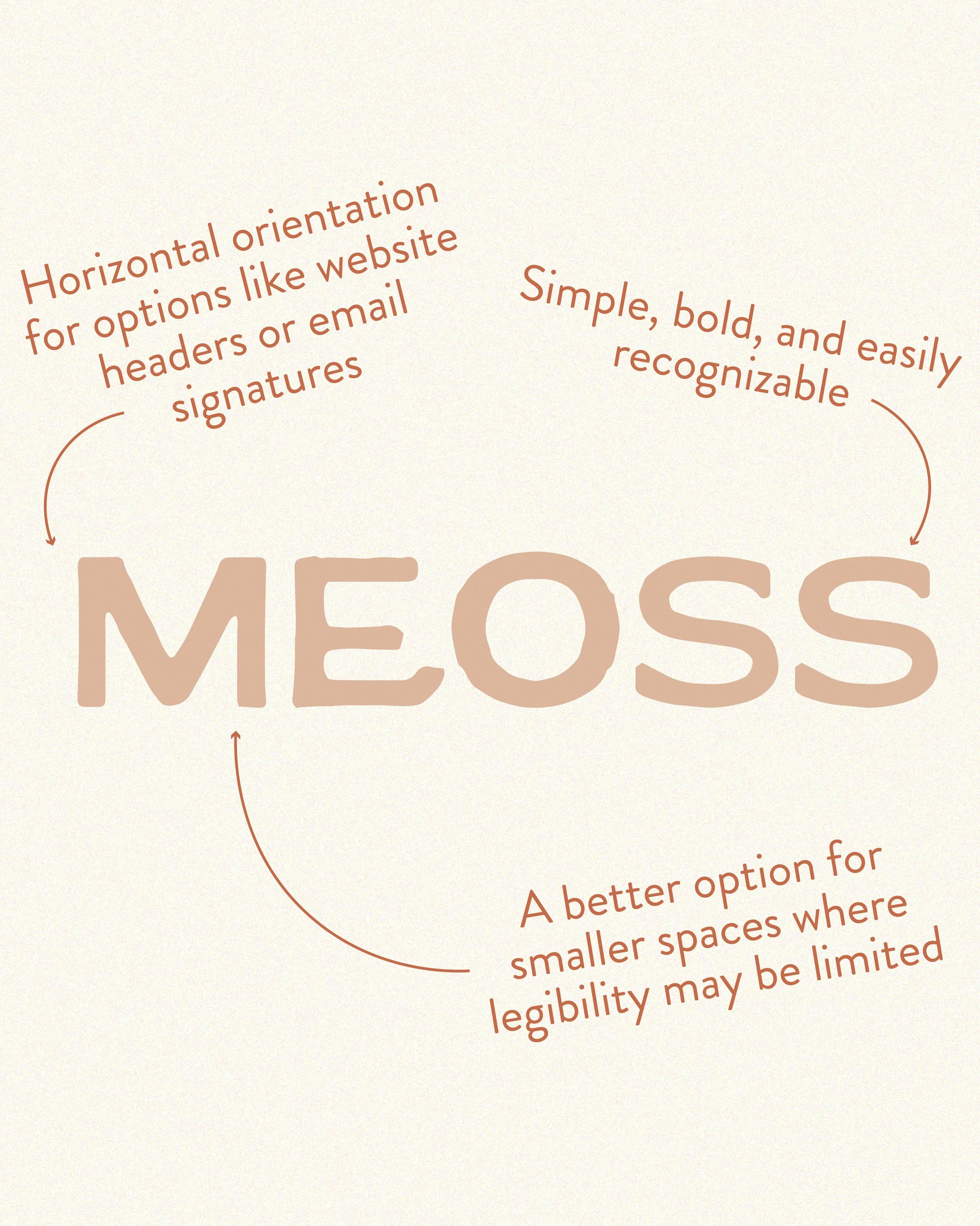
SUBMARK OR ICON

Here’s where terminology gets tricky. You’ll hear designers use terms like submark, icon, favicon, or watermark and quite frankly, none of it matters. I refer to them as submarks but what you need is they are a highly condensed version of your logo. They should be simple, clean, and easily recognizable even in small spaces. If you have a long company name, it’s going to read like shit on your instagram profile picture. You need a submark/icon/favicon/watermark for limited spaces but you can call it whatever you’d like.
Super clear…right? Designers like to make it confusing so let’s keep it simple. You need the logo with all of your shit, a logo with an alternate layout, and a logo you can use in small spaces. And now I know your next question…how do I know when to use them?
People are looking for really specific instructions, like “your primary logo needs to be the header on your website” or “always use your secondary logo on your business card” because people like to be told what to do. Having the way you’re “supposed” to do things should make it easier, but what if the logo you’re supposed to use looks like shit in the space you’re supposed to use it? Rules don’t really work in design so instead of telling you which logo to use based on the content you’re creating, I encourage people to focus on who you’re creating the content for. I shift the focus onto your target audience, because let’s be honest every decision should go back to them. My decision on which logo to use is based on the specific audience you’re engaging with and how familiar they are with your offerings.
WHEN YOUR AUDIENCE IS FAMILIAR WITH YOUR BUSINESS: use the logo that fits the space. If you need a horizontal logo use your horizontal logo. If you need a profile picture for your instagram that’s legible in a small circle use your submark. If the space is a little tight and your primary logo has too much text use the alternate logo. Use what you want. Your audience already recognizes your business and if you’ve done your branding well, all of your logos should quickly identify your business.
WHEN YOUR AUDIENCE IS UNFAMILIAR WITH YOUR BUSINESS: as long as it fits, use the primary logo. I say that because the most important aspect is always going to be if it fits. Don’t squeeze a giant primary logo in a space that it doesn’t fit and the additional information you can’t even read. Do your best within the context provided to include more about what you do so that the logo doesn’t have to do all the work. There’s a chance you end up needing 4 logos because you want a two primary logos but in different layouts. 3 is the minimum number of logos I suggest.
So to wrap things up you should have at least three logos: one with all of your shit, a slightly different version in a different layout, and a condensed version. When you use them is mostly up to you, but as always: put your target audience first. While the focus of this blog is to answer your questions on the number of logos your business needs, remember that a brand is so much more than just your logo. It’s the heart and soul of your company and there’s a lot of running parts so if all you’ve considered thus far is your logo, make sure to download my free checklist of all of the items you need to form your brand identity.
ABOUT THE AUTHOR:
ERIN KELLY-SULLIVAN

When you bring someone in to help with your business you really want them to understand your needs. My time as a PT gives me that background to truly understand your business, your target audience, and the field. If you want to work with someone who gets you, my specialty is helping fellow physical therapists, strength coaches, and anyone in the health and performance field reach their branding goals.
WANT MORE HELP LIKE THIS? FOLLOW ALONG ON INSTAGRAM:


READ MORE