MEOSS WELLNESS
BRAND DESCRIPTORS: inviting, natural, organic, warm
SCOPE: brand identity, website design
PULLING INSPIRATION FROM LIFE
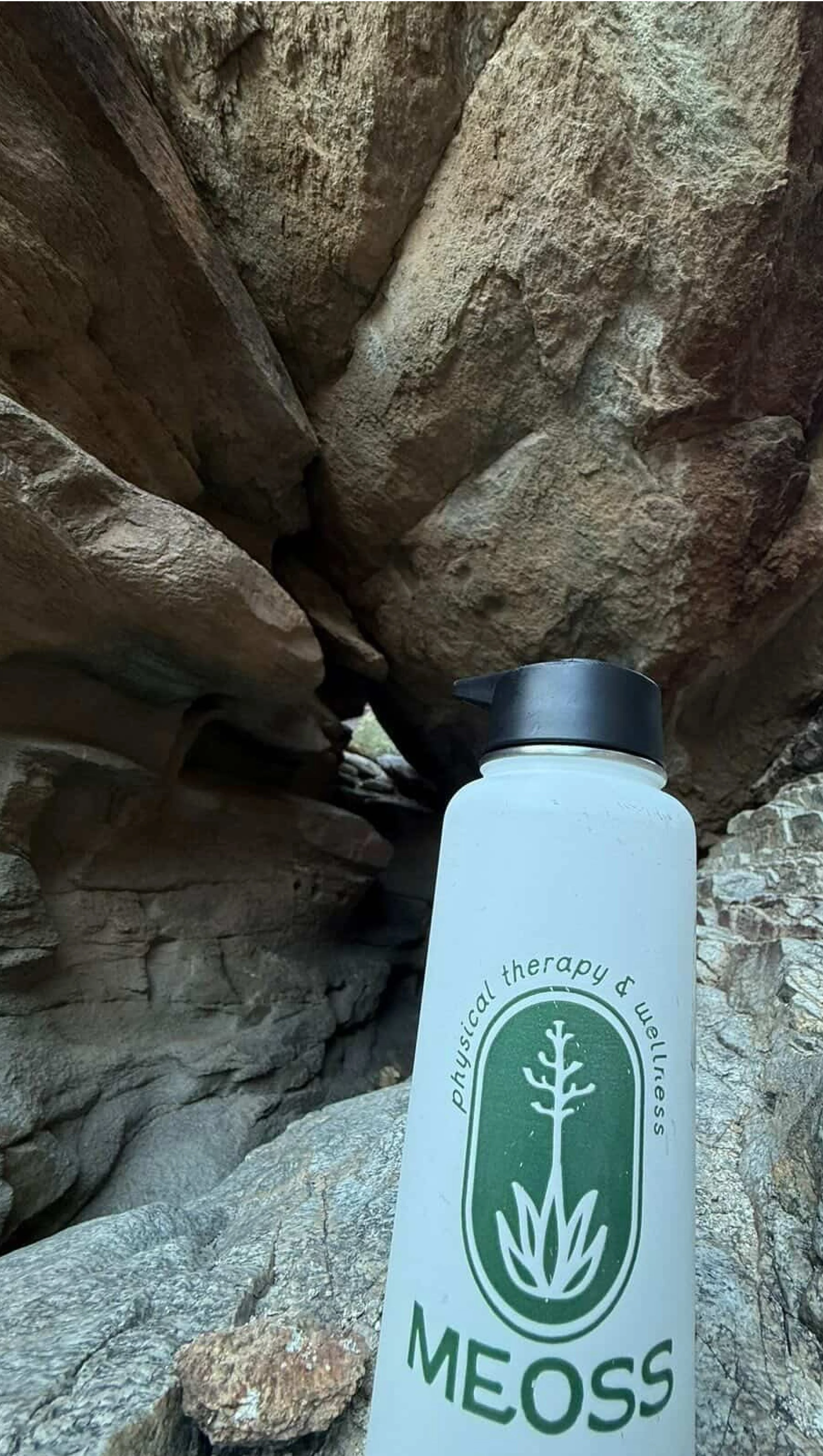
My client Celeste mentioned that she wanted her brand to feel very natural and welcoming, leaning into the desert landscape in Arizona, but was afraid that it would no longer feel like a physical therapy logo. She wanted a way to merge the two, to give her clinic a warm, inviting, and natural feel without losing sight of the fact that it was still a medical clinic.
THE DESIGN PROCESS
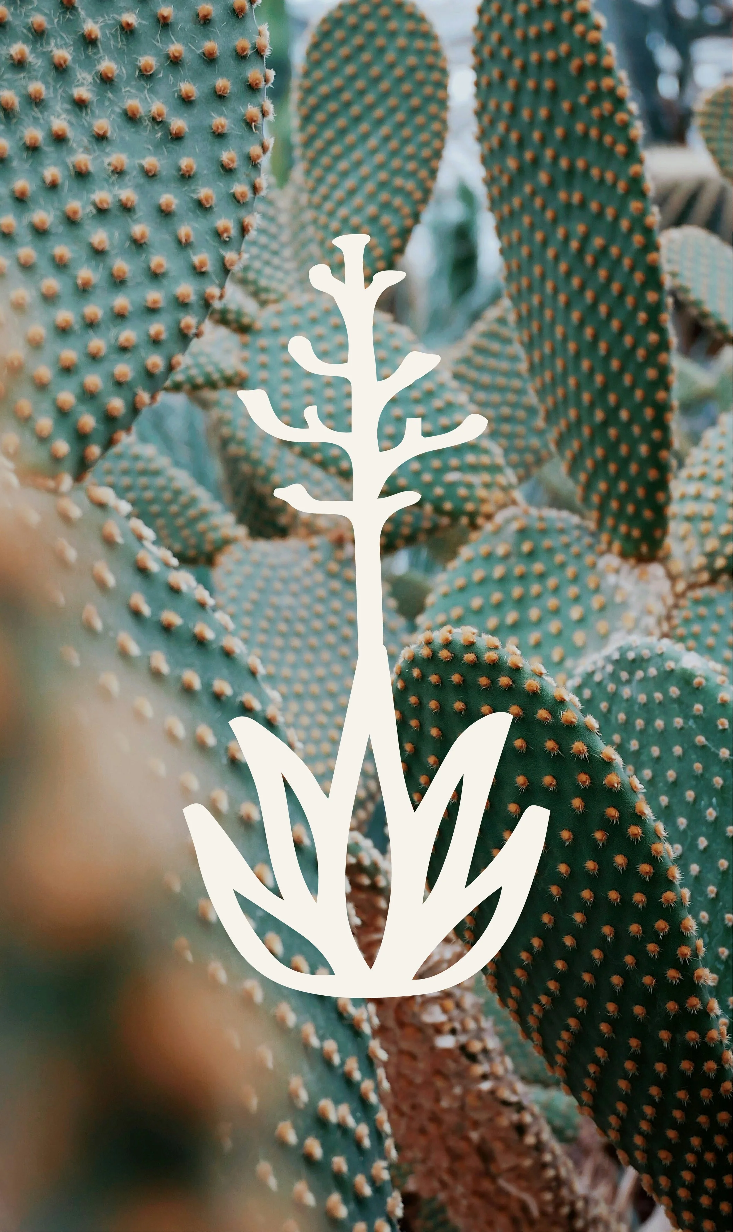
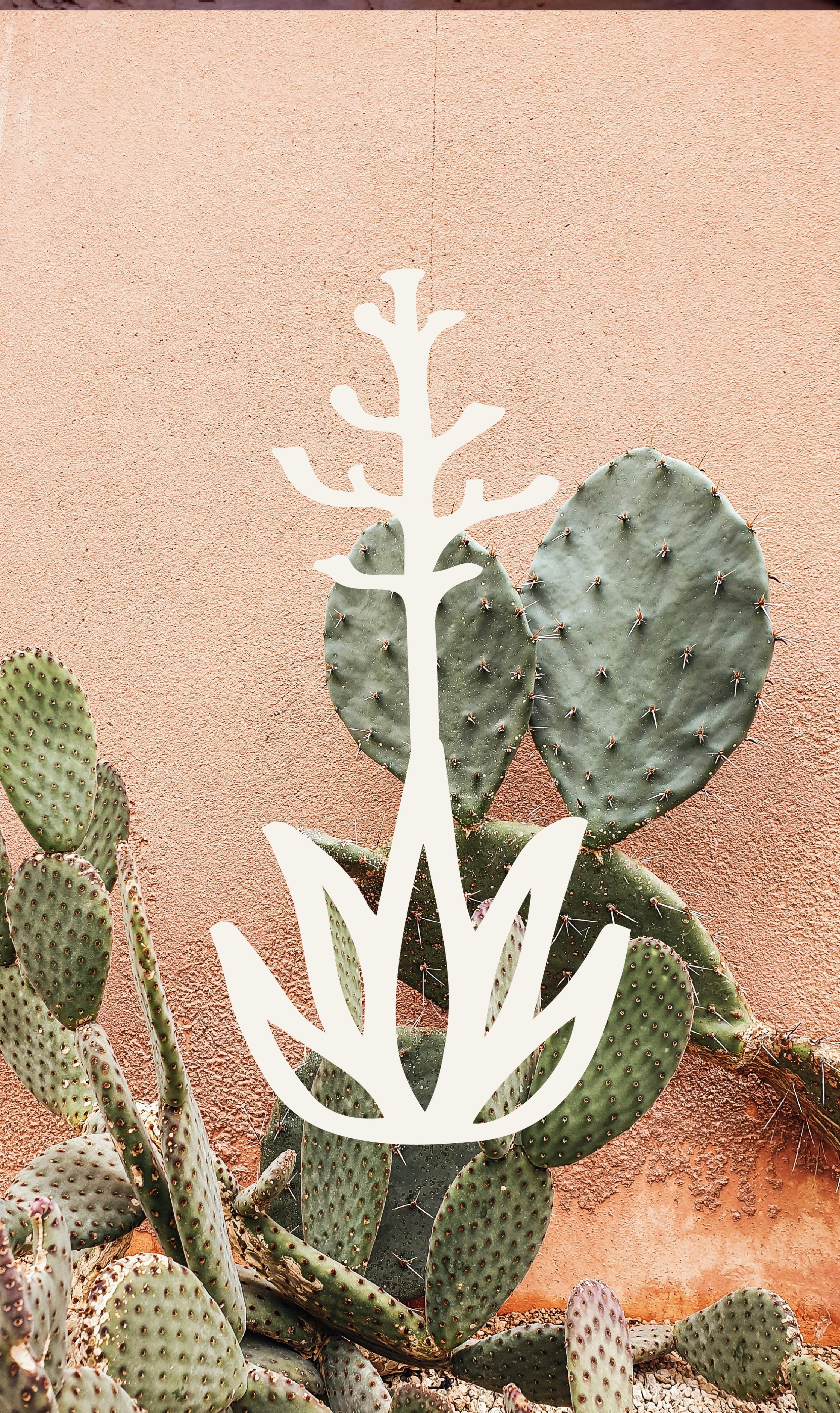
During our discovery call, Celeste explained her reason in deciding on the name Meoss is that we’re all striving for homeostasis. The human body is in a constant search for balance and we live within this cycle of life and death. We discussed the idea of using an agave in her logo, but specifically one with a death bloom. When an agave is about to die, it produces one final, magnificent flower filled with seeds to continue it’s legacy. We formed her brand around this idea that humans follow a similar pathway: adapting, growing, and transforming.