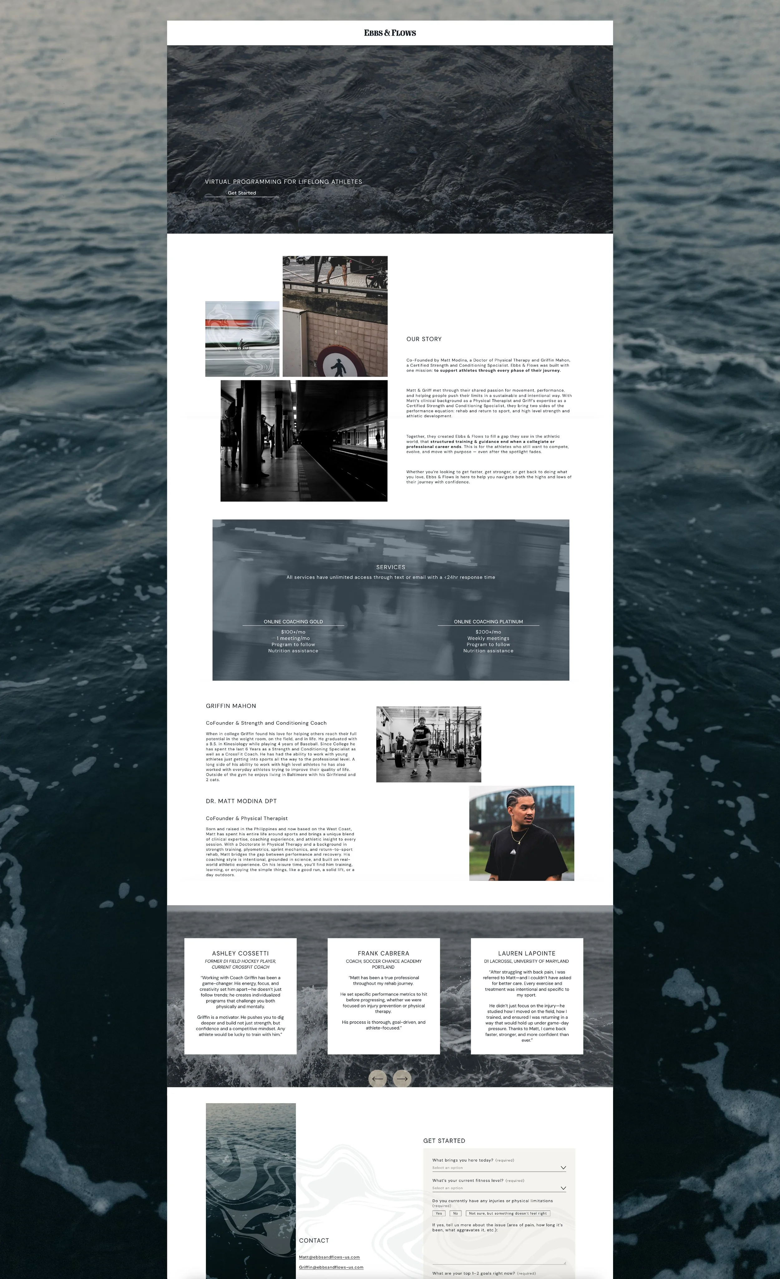
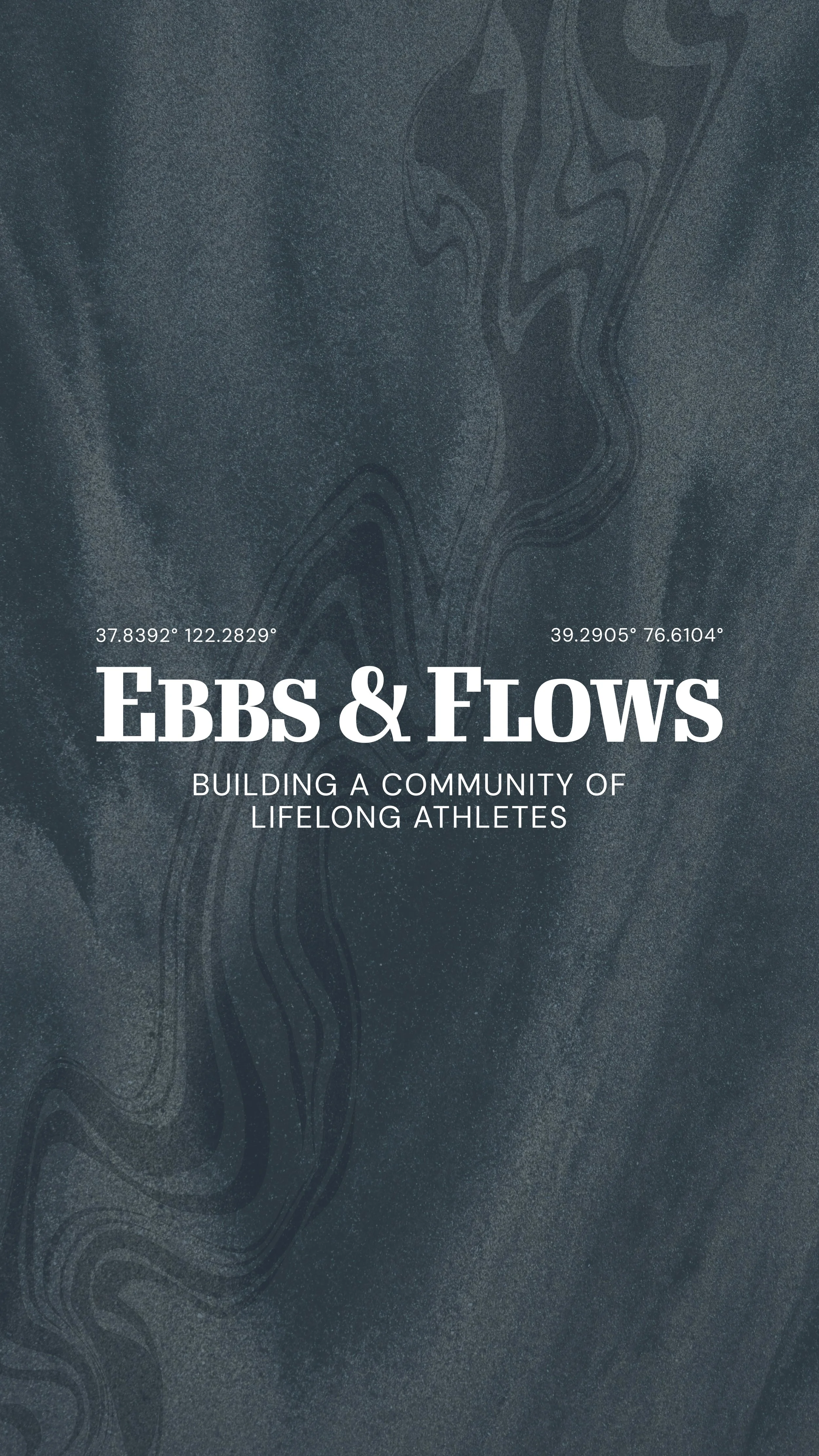
EBBS & FLOWS
SCOPE: brand identity, website design
BRAND DESCRIPTORS: authentic, cultured, refined, sustainable, uplifting
BUILDING A COMMUNITY
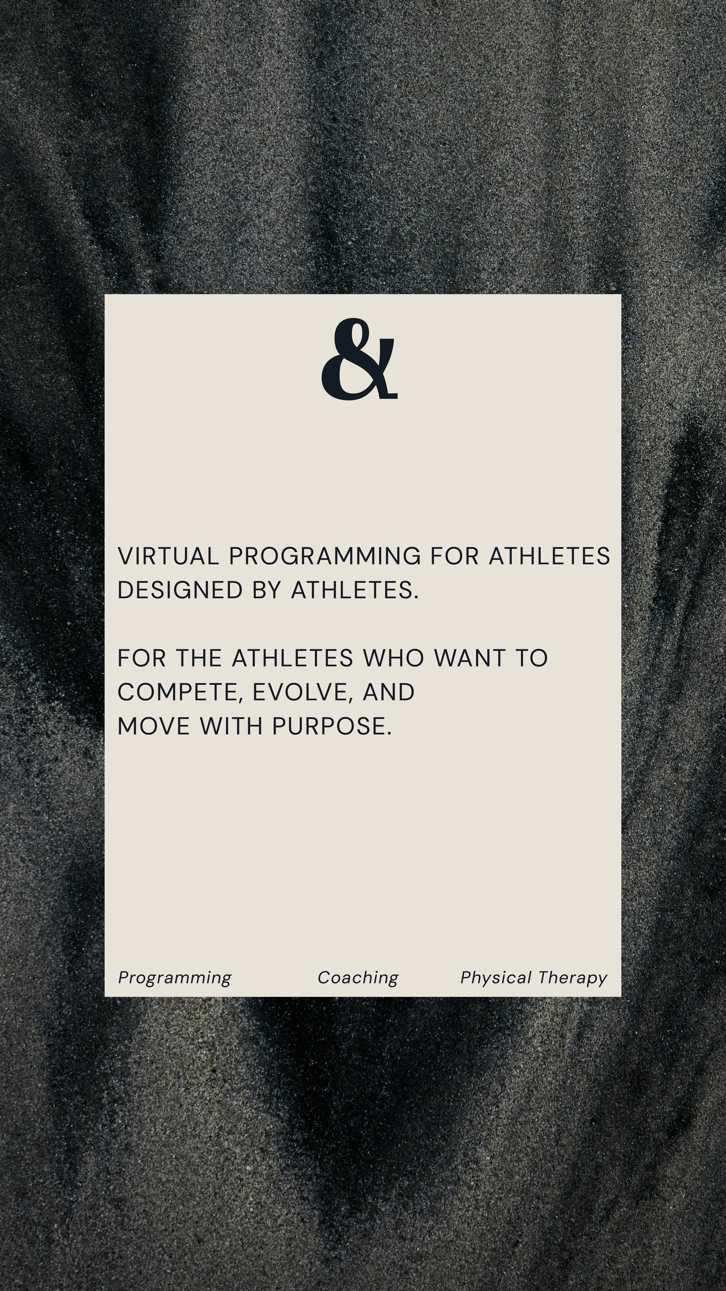
For this project, my clients came to me with a vision. They wanted to accomplish two things: first, to create a community for active individuals. Specifically, those athletes who are used to having a sense of community and support who feel lost once that sport has run it’s course. And second, they wanted to create merch that people actually wanted to buy. They already knew they wanted their brand to feel different from the standard gym or physical therapy brand and came to me to help accomplish that.


THE DESIGN PROCESS
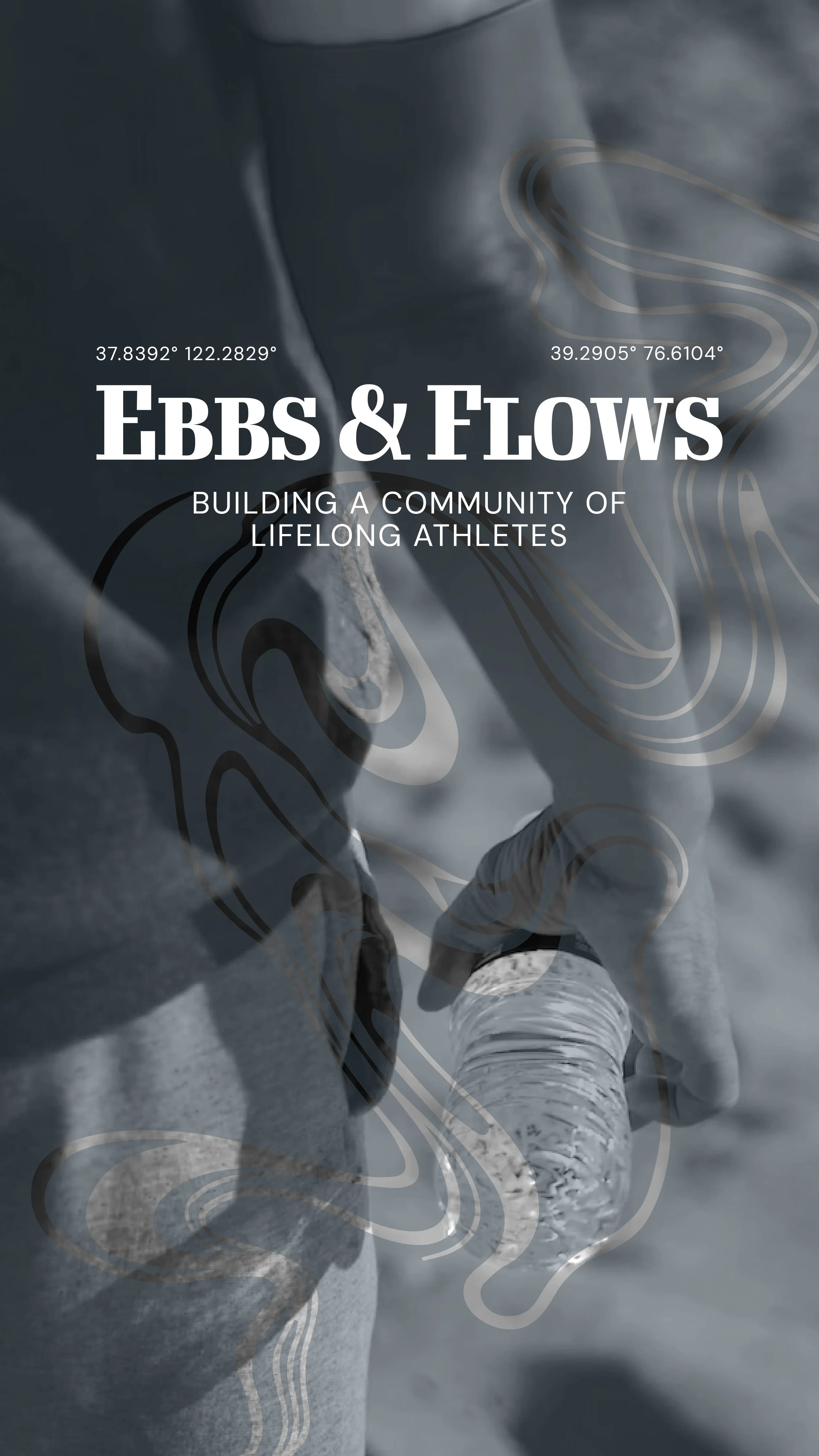
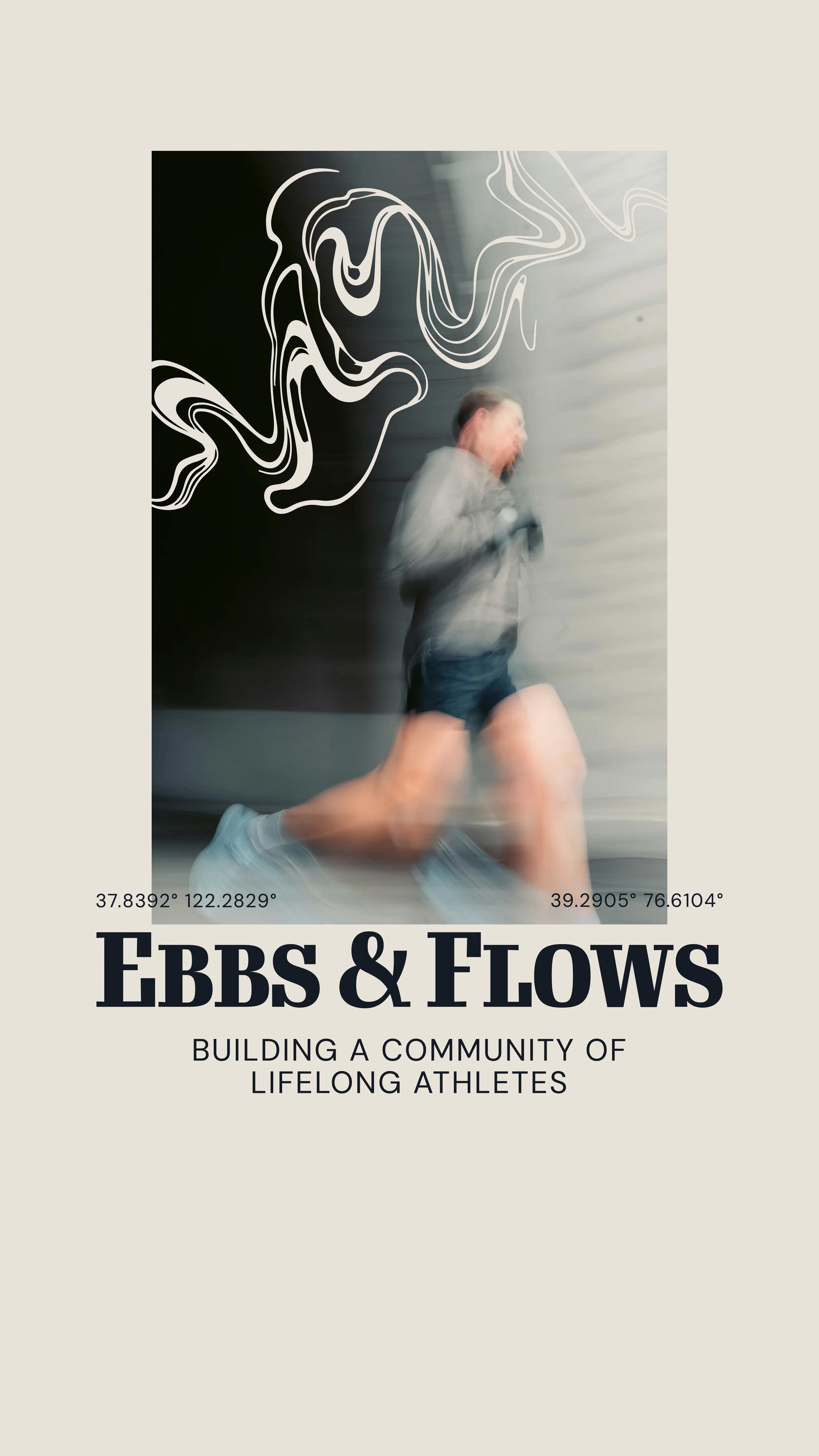
A lot of people mistakenly assume a brand is just a logo, when in reality it’s much more than that. When speaking with my clients, it was clear that the logo itself wouldn’t be incredibly heavy on design. Rather, it was the messaging, personality, imagery, and colors that would bring life to this brand.
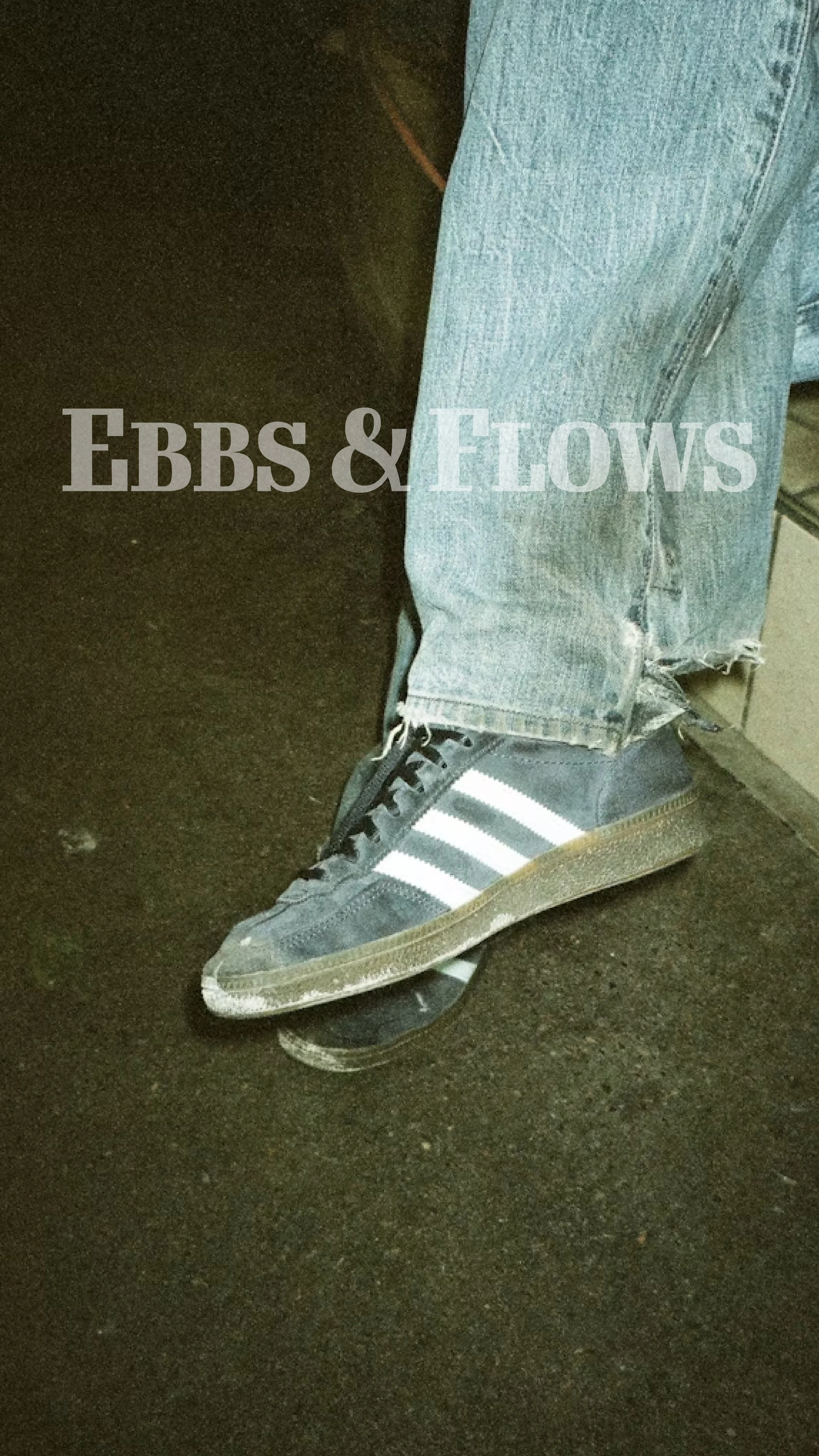
So we created a clean, iconic logo including coordinates of my two clients on opposite coasts, and the messaging they want to portray to their audience. To capture the elevated look they were envisioning, we gathered bold imagery and created a water-inspired graphic to set their business apart.